Bootstrap 3 Change Notes
After spending the last two days working with Bootstrap 3 I wanted to jot down a few of the things I found in case I forget them tomorrow or to help anyone else running into similar issues.
Forms, Grid System, and Screen Resolutions
We have converted our forms from form-horizontal to the default Bootstrap form. We think it looks better with the new update.Old code:
<div class="control-group span4">
    <label class="control-label">
        {{ form.email.label_tag }}
    </label>
    <div class="controls">
        {{ form.email }}
    </div>
</div>
New code:
<div class="form-group col-4">
    {{ form.email.label_tag }}
    {{ form.email }}
</div>
Cleaned up a bit as we had that extra label tag on our old code which was unnecessary as Django adds the label tag correctly on render. One of the biggest thing to notice is that the span4 tag changed to col-4. Bootstrap is now responsive by design and mobile first which means that the col- tags are meant for display on a mobile device but are the default when no other tags are found. This gives us the ability to make pages and forms that appear differently depending on screen resolution. There are three tags for column spacing, col- for mobile devices, col-sm- for tablet screens, and col-lg- for desktops. To use the various screen sizes just add on more tags. The sizes will appear when viewed on different resolutions. Making the above example take up the whole row on a mobile device and only a third of the screen on a desktop would change the code like so:
<div class="form-group col-12 col-lg-4">
    {{ form.email.label_tag }}
    {{ form.email }}
</div>
Easy enough right? I thought so too! Not all of us will have a mobile device or tablet ready to go to test our site on different resolutions. You can always just resize your window to see what happens but that is annoying too. Luckily, we found a great site that will take any URL and display the page at any screen resolution and has a lot of built-in resolutions for common devices called Screenfly. This even works for pages hosted locally.
Modals
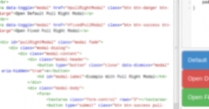
Modals had a lot of changes made to them which made us redo all of our current modals because they were all broken. Example:Old code:
<a id="{{ modal.id }}" href="#my_modal" role="button" data-toggle="modal">Open Modal</a>

<div id="my_modal" class="modal hide fade" tabindex="-1" role="dialog" aria-labelledby="myModalLabel" aria-hidden="true">
    <div class="modal-header">
        <button type="button" class="close" data-dismiss="modal" aria-hidden="true">×</button>
        <h3 id="myModalLabel">{% trans "My Modal" %}</h3>
    </div>
    <div data-id="{{ modal.id }}" class="modal-body my_modal_div"></div>
</div>
New code:
<a id="{{ modal.id }}" href="/myapp/modalbody/{{ modal.id }}/" data-target="#my_modal" data-toggle="modal">Open Modal</a>
<div id="my_modal" class="modal fade">
    <div class="modal-dialog">
        <div class="modal-content">
            <div class="modal-header">
                <button type="button" class="close" data-dismiss="modal" aria-hidden="true">×</button>
                <h4 id="modal-label">{% trans "My Modal" %}</h4>
            </div>
            <div data-id="{{ modal.id }}" class="modal-body my_modal_div"></div>
        </div>
    </div>
</div>
A few things to note, the first of which is that the old code was using JavaScript to load in the contents of a page into the modal. Turns our Bootstrap did this already if you just provided the link in the href. Now we know. The hide class has been removed. When the modal is opened Bootstrap adds the modal-open class to the body which stops scrolling on the page and limits it to the modal only. Pretty awesome. Make sure your JavaScript files are being loaded at the bottom of your HTML pages to ensure this works correctly.
One thing we have been trying to do is put all Save buttons on the right side of our pages and modals. Using the Bootstrap pull-right class floats objects to the right. The problem with this is the modal-content div will not grow with floated objects. More specifically no outer div will grow with floated elements by default. To get around this you simply need to add a bit of CSS.
.modal-content {
   overflow: auto;
   padding-bottom: 15px;
}
This works perfectly for any modal with a floated right button at the bottom but if there isn't anything floated at the very bottom of the modal this will add an extra 15px to the padding, which we don't want. To fix that just make that CSS a bit more specific by using id's on the modals you want to specifically fix. I have made a jsFiddle which demonstrates exactly what I am talking about.
Closing
That's it so far. Most of that took a really long time to figure out. Bootstrap dropped their typeahead JavaScript in favor of typeahead.js which I'm still trying to figure out fully. I've got it to work but there are some really weird things happening that I think have to do with Bootstrap 3. The biggest problem we are running into is that Bootstrap 3 is so new no one has written much about how to fix little problems like the ones we've had so far and other utilities haven't updated to fully support it yet so we soldier on.Let me know if you have any other tips or if you've had anything that has tripped you up so far.