Bootstrap ScrollSpy Pitfalls and Fixes
Designing our new internal marketing tools has been a pet project of mine for a couple of weeks now. I spend a little time here and there adding information and tools for our employees to better understand our relationship with our clients. I'm displaying basic contact information, some information on the kind of business we do with them, a log of notes we take, past business, and company information. All of that equates to a rather long page of information. All of the information is relevant and displayed in an attractive compact manner the problem is it is just so much information that it can be overwhelming. I showed it to a coworker and he wanted tabs to flip between the various bits of information because he found it overwhelming. I didn't want to go to tabs because of the increased difficulty that would be added when they wanted to print off the marketing information and I didn't feel that tabs were the right way to go here. With that in mind I needed another solution for a large page of information that could be easily navigable...enter Bootstrap ScrollSpy.
Anyone who has looked at the Bootstrap documentation will immediately notice that has exactly the same problem I'm having; long page with lots of information. On the left they have a static menu that follows you and highlights what section you are currently in. Clicking on any one of those links will bring you to that portion of the page. If it's good enough for them it's good enough for me so I set about recreating their side menu style.
ScrollSpy can be used with any .nav menu whether it is one your create with a ul or if it is the main nav-bar at the top of the screen. ScrollSpy works by checking what element is currently at the top of the visible screen and adding making that nav element active. This is great but there are a few quirks and tweeks that took me a while to figure out.
At the most basic level you want to add the HTML 5 data-spy attribute to your body because that is what we are going to spy on. Here is the example code from Bootstrap's documentation.
<body data-spy="scroll" data-target="#navbar-example">
...
</body>
The data-target attribute needs to point to the parent element of your nav. So if you have a nav-bar you'll need to have an outer div or element with the id that you will use in your ScrollSpy.
Now all of your elements in your nav will need to have an href pointing to the id of the element you will be spying on. These will need to be valid elements in your DOM. If you are adding things dynamically and need to update your ScrollSpy use
$('[data-spy="scroll"]').each(function () {
  var $spy = $(this).scrollspy('refresh')
})
That's it for the simple example. Set the data-spy and data-target on your body tag and you should be all set assuming your nav is set up properly. One issue you may run into is not spying on the body. When I originally started this I wasn't spying on the body tag because I was loading in a template using Django's block tags. Granted it was within the body tag at one point but not specifically and I wanted to only watch my div. ScrollSpy will only work correctly on non-body tag elements if they have a fixed height and a scroll bar. If you do not have a scroll bar on the element you are spying on it will not work. Your nav-bar will always have the last element as active. To fix this just give the element you are spying on a fixed height and you should be good. In my case instead of using the HTML 5 tags on the body I used JavaScript. The body tag is used in every page and I didn't want the ScrollSpy loaded on every single page. In my JavaScript for my marketing page I have the line $("body").scrollspy({target: "#side-nav", offset:50});. The offset tells ScrollSpy by how many pixels to offset the scroll before we are actually "in" the element. I added some padding so when you see the header near the top we are now in the section.
To mimic the fixed sidebar used on the Bootstrap documentation use either the Affix JavaScript from Bootstrap or the affix class on your nav. Below I have my full example and how it all works.
HTML
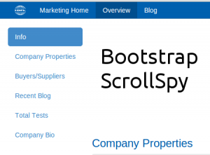
<div id="side-nav" class="col-sm-2 hidden-xs hidden-sm hidden-print">
    <ul class="nav nav-pills nav-stacked affix">
        <li><a href="#info">Info</a></li>
        <li><a href="#properties">Company Properties</a></li>
        <li><a href="#genome">Buyers/Suppliers</a></li>
        <li><a href="#blog">Recent Blog</a></li>
        <li><a href="#tests">Total Tests</a></li>
        <li><a href="#company-bio">Company Bio</a></li>
   </ul>
</div>
<div id="company-content" class="col-xs-12 col-sm-12 col-md-10">
<a name="info" id="info"></a>
<h4>Info</h4>
...
<a name="properties" id="properties"></a>
<h4>Company Properties</h4>
...
etc.

</div>
JavaScript
$(document).ready(function(){
    $("body").scrollspy({target: "#side-nav", offset:50});
});
I hide the side nav on smaller resolutions to give more screen real estate. The a tags have both a name and an id because the id is used by ScrollSpy and the name is used as a normal locator on a page. Let me know what you think and if there are any questions or comments.