How to Make Bootstrap Modals
One of the most commonly used features of Bootstrap is their Modal component. If you don't know what a modal is it is like a pop up except it can contain HTML. This means you can put any sort of information you'd like in it, a common example is a modal that contains a login form. This post will show you how to create your own modals and even load in the content dynamically using AJAX.
Modal Basics
Let's start with the most basic modal that contains static content. You'll need two things. The first is a button or link to trigger the modal. Secondly, you'll need to put the modal div somewhere on your page. Below is some example code with the button and the modal div.
<!-- Button trigger modal -->
<button class="btn btn-primary btn-lg" data-toggle="modal" data-target="#myModal">
Launch demo modal
</button>
<!-- Modal -->
<div class="modal fade" id="myModal" tabindex="-1" role="dialog" aria-labelledby="myModalLabel" aria-hidden="true">
<div class="modal-dialog">
<div class="modal-content">
<div class="modal-header">
<button type="button" class="close" data-dismiss="modal" aria-hidden="true">×</button>
<h4 class="modal-title" id="myModalLabel">Modal title</h4>
</div>
<div class="modal-body">
...
</div>
<div class="modal-footer">
<button type="button" class="btn btn-default" data-dismiss="modal">Close</button>
<button type="button" class="btn btn-primary">Save changes</button>
</div>
</div><!-- /.modal-content -->
</div><!-- /.modal-dialog -->
</div><!-- /.modal -->
This code was taken from Bootstrap's example for modals. Let's break it down a bit starting with the button. You'll see that the button is styled with some standard Bootstrap classes to make it large and blue. After that you'll notice two HTML5 data tags, data-toggle and data-target. Bootstrap uses these to know that you are planning on using this to open a modal and with content in the id contained in data-target.
Our modal div is labeled with the id of the data-target from the button. In that .modal there are a lot of other elements listed in their example. The class .modal makes Bootstrap know this is a modal and .fade refers to how the animation will work when it needs to be shown. The tabindex is set to -1 to avoid any unforeseen issues with tabbing through your page. The next three are for accessibility purposes like screen readers and can be omitted if you are not supporting screen reading technologies.
The modal is broken down into sections represented as various divs. Each div needs to have a corresponding modal class to ensure that Bootstrap can display it correctly. It is a good idea to have all of these divs in place even if you don't put content in all of them. The first is the .modal-dialog. This is where everything that is the modal will be contained. The next div is .modal-content. This is where all of your content like text and buttons will eventually be placed. There are three sections to a modal, the header, the body, and the footer. They are labeled with the classes .modal-header, .modal-body, and .modal-footer.
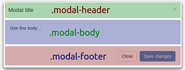
The .modal-header is where you place your title and close button. You'll notice in the example that the button in the .modal-header contains an HTML5 data element called data-dismiss="modal". This tells Bootstrap to close the modal when this button is clicked.
Inside of the .modal-body is where you'll place your form and whatever other content you need. Essentially this acts just like a smaller web page. You can use all of the Bootstrap formatting and styling and place any JavaScript and content you'd like in here. Later we will see how to put dynamically loaded content in here.
Finally, there is the .modal-footer. Most of the time you'll put another close button down here because a lot of users are used to having both an 'x' in the upper right corner and a close button at the bottom. You can also put any text or maybe a Submit button for your form in here as well.
Loading Content with AJAX
Sometimes you'll want to load in the content of the modal using AJAX. There are a couple of ways to do this but using jQuery but here we will use the Bootstrap data elements to make Bootstrap do the leg work for us. Taking the above example we just need to make a few minor changes.
Main.html
<!-- Button trigger modal -->
<a href="/modal/content/" class="btn btn-primary btn-lg" data-toggle="modal" data-target="#myModal">
  Launch demo modal
</a>

<!-- Modal -->
<div class="modal fade" id="myModal" tabindex="-1" role="dialog" aria-labelledby="myModalLabel" aria-hidden="true">

</div><!-- /.modal -->
Changing the button to an a tag allows us to give a URL in the href parameter. Bootstrap interprets this as the content to be loaded and the data-target to be where the content is to be loaded.
ModalContent.html
<div class="modal-dialog">
<div class="modal-content">
<div class="modal-header">
<button type="button" class="close" data-dismiss="modal" aria-hidden="true">×</button>
<h4 class="modal-title" id="myModalLabel">Modal title</h4>
</div>
<div class="modal-body">
...
</div>
<div class="modal-footer">
<button type="button" class="btn btn-default" data-dismiss="modal">Close</button>
<button type="button" class="btn btn-primary">Save changes</button>
</div>
</div><!-- /.modal-content -->
</div><!-- /.modal-dialog -->
You'll notice that I've moved everything except the .modal to a separate page. From our testing and experience this was the most consistent way to load content into the modal without any weird CSS or loading issues.
That's all there is to it. Modals are powerful and wonderful. Gathering information from the user or displaying a small bit of information without making the user leave the page is a wonderful thing to add to any webpage. Let me know how you are using modals below in the comments.