Making Beautiful JQuery Graphs With JqPlot
One of the best ways to make a page of data better is having a nice, visual way of looking at the data and graphs and charts do a great job of that. Figuring out which graph works best for your situation is up to you but in almost all of the cases jqPlot has a way of rendering that on your website. JqPlot is an open-source project with a ton of features, graph and chart types, and visual options to make wonderful graphs for your site. Today I'm going to go over a few of the different types of graphs and then give some more advanced tips on using jqPlot.
Line Graph and Others
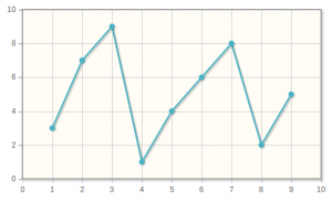
One of the big features of jqPlot is its plug-ability. You don't need to load every jqPlot script in on every page you only need to load in the relevant script used for the graphs on your page. This cuts down on loading time and makes your code easier to read.Line graphs are the most basic of graphs and they are so easy to setup with jqPlot. Below is the code and the result. I've inserted it as an image here but on your page it will be rendered as HTML.
$(document).ready(function(){
  var plot1 = $.jqplot ('chart1', [[3,7,9,1,4,6,8,2,5]]);
});
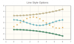
Line graphs can have multiple sets of data to have more than one line of data. Using the options you can even change the style of each line in the graph. Below is an example from their website and you can see the options that they have changed to make each line look different.
var plot3 = $.jqplot('chart3', [cosPoints, sinPoints, powPoints1, powPoints2],
    {
      title:'Line Style Options',
      // Series options are specified as an array of objects, one object
      // for each series.
      series:[
          {
            // Change our line width and use a diamond shaped marker.
            lineWidth:2,
            markerOptions: { style:'dimaond' }
          },
          {
            // Don't show a line, just show markers.
            // Make the markers 7 pixels with an 'x' style
            showLine:false,
            markerOptions: { size: 7, style:"x" }
          },
          {
            // Use (open) circlular markers.
            markerOptions: { style:"circle" }
          },
          {
            // Use a thicker, 5 pixel line and 10 pixel
            // filled square markers.
            lineWidth:5,
            markerOptions: { style:"filledSquare", size:10 }
          }
      ]
    }
  );
Advanced AJAX
var ajaxDataRenderer = function(url, plot1, options) {
        var ret = null;
        $.ajax({
            async: false,
            url: url,
            dataType: "json",
            success: function(data) {
                ret = data;
            }
        });
        return ret;
    }
//Labels
var labels = []
labels.push({label:$("#customer_name").text()});
$("#supplier_table tr").each(function(){
    labels.push({label:$(this).find("td").attr("data-name")});
});

//Line Graph
var plot1 = $.jqplot ('tests_plot', "totaltests/", {
    title: gettext("Total Tests By Year"),
    legend: {show:true, renderer:$.jqplot.EnhancedLegendRenderer, location:'nw'},
    series:labels,
    dataRenderer: ajaxDataRenderer,
    seriesDefaults: {
        pointLabels: { show:true }
    },
    axesDefaults: {
        labelRenderer: $.jqplot.CanvasAxisLabelRenderer
      },
    axes: { xaxis: { pad:0, } }
});

//Bar Chart
var plot2 = $.jqplot ('tests_bar', "totalcategory/", {
    title: gettext("Total Tests By Category"),
    legend: {show:true, renderer:$.jqplot.EnhancedLegendRenderer, location:'nw'},
    series:labels,
    dataRenderer: ajaxDataRenderer,
    seriesDefaults: {
        renderer:$.jqplot.BarRenderer,
        pointLabels: { show:true }
    },
    axesDefaults: {
        tickRenderer: $.jqplot.CanvasAxisTickRenderer ,
        tickOptions: {
            fontSize: '10pt'
        }
    },
    axes: {
        xaxis: {
        renderer: $.jqplot.CategoryAxisRenderer
        },
    }
});
The first variable function is used in the two jqPlot calls as an AJAX helper. The next section, labeled Labels, is used to get the labels for the graphs. The labels for the graph need to be there when the graph is rendered and cannot be added after. I have the names of the series' around the page so I just pull them. Another way you could do it is the return a dictionary from your AJAX call and then split it in the ajaxDataRenderer function but I have done it this way. To use the renderer you just call jqplot, give the target and the remote URL and everything should run smoothly.
The line graph is first and as you can see I have a title, which is translated using Django's JavaScript translation, we put the labels and pad the axis to make everything flush. The bar chart is similar in almost every way with the exception of a couple of options specific to bar charts. Below is the result of the two graphs I've created. Some of the text is a bit scrunched together so a little rework is needed but for the most part it is ready to go. Changing fonts and sizes is simple with the jqPlot options.

Nothing too special but it works for me and looks great on the page. I hope this has been informative to someone. JqPlot is pretty vast in its documentation and can be a little overwhelming. If there are any questions or weird things you come across feel free to comment below.