Take Advantage of the Bootstrap Grid
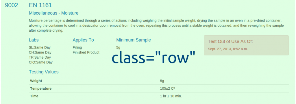
One of the biggest features of Bootstrap is their responsive grid. It helps developers and designers easily space out content on a page without having to worry about margins and screen sizes. I've done some posts in the past talking about the best way to use the various screen size related tags. Today I wanted to focus on taking all of that to the next level. The grid system works at every level as far down as you want to go. Below is a catalog I created which quickly informs of a moisture test. There is a lot of information to display and doing so in a clean format is hard. Using Bootstrap's grid system at every step has helped to create what you see below.

This is the final result that we will be breaking down. You can see that there is a test number on the left without anything underneath it, a larger section with text followed by smaller sections and even a table. Let's break down every layer and div.
The outer div of the entire thing is given the class row. The row class keeps everything tight to the 12-column Bootstrap design and doesn't let things roll over unexpectedly. If you forcefully go over the 12-columns it will obviously bump it but sticking the row class on an outer div will help keep everything together. This is also useful for printing as I don't want a row to ever be cut between two pages. You can either add @media print{ .row{page-break-inside:avoid; } or give that outer div an extra class that you give the CSS to so that it won't split between two pages.
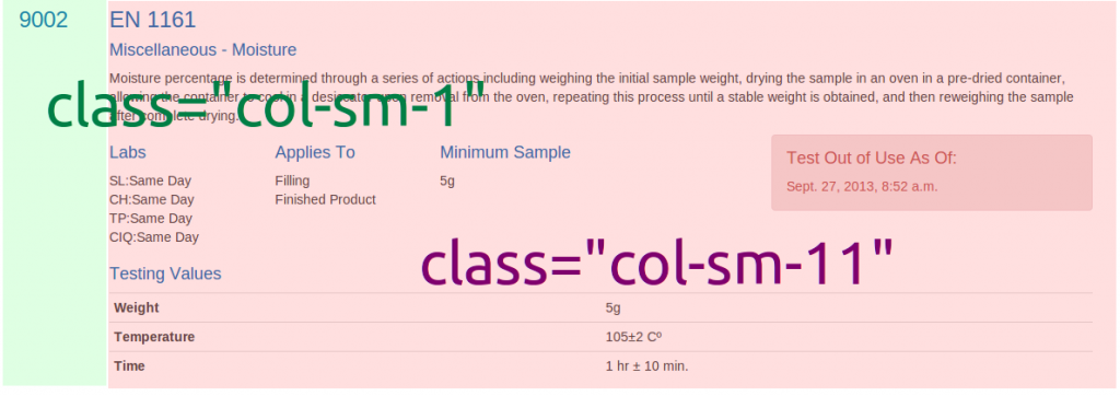
Here you see how I did the test number on the left with nothing underneath while having a lot of content on the right. I give one column to the number and eleven to the content.

Looking inside of the larger div there is a lot more going on. To start off with I use header tags which give breaks after each header and then a <p> tag around the description. After that I create a brand new row, yup a row within a row (rowception! OK, I'll stop), which holds even more information that we will break down next. Last we have a simple header and table. This table does not have a normal thead/tbody since I put the th tags and td tags on the same line. To have consistent spacing on th/td cells across all tables I have added the CSS table { table-layout: fixed;}.

The final piece goes even deeper as we have already been dissecting a row let's break apart this new row. Still using the twelve column system of Bootstrap I have given every column a spacing of 2 except the last one which is size 4 with an offset of two. Notice how using the row on the outside gives us a fresh twelve column grid to work within inside of an already created component. Inside of each of those grid elements you can add whatever you'd like, including more rows! The first and second contain unformatted lists, the third is a paragraph, and the fourth contains a Bootstrap alert.
That's all there is to it! Bootstrap gives you everything you need to create perfectly spaced content at every level on the page. If twelve columns isn't right for you they even allow you to customize how big you want your columns. I hope this was informative and demonstrated how to use Bootstrap above and beyond their simple examples on their page. If you have any great tips when using Bootstrap please leave a comment below.